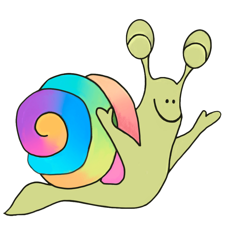
Eenie is a very very special snail – he has a magical shell that not only protects him but also helps him. Most of the colours are like a rainbow and change often – they are truly magical. Eenie’s world is really colourful.
Colour is everywhere! Look around you. How many colours can you see? Do you know the names of colours and how to spell the colours properly?
People see colours differently according to their vision or eye sight. We have cone cells in our eyes; these detect three primary colours of light which are red, green and blue. The number of primary colours in the world also three as these form our colour perception. In the world of colour, therefore, red, blue and yellow are the primary colours that cannot be made with mixtures of other pigments and can be combined to create additional colours of the rainbow.
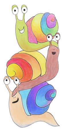
Here is a colour diagram to show some of our most common colours. The first seven colours on the wheel are the colours of the beautiful rainbow. Several of them are found on Eenie’s shell – the colour changes in different situations and circumstances. Eenie also has several friends and family who have different colours on their shells.

1. red
2. orange
3. yellow
4. green
5. blue
6. indigo
7. violet
8. purple
9. pink
10. silver
11. gold
12. beige
13. brown
14. grey / gray
15. black
16. white
Colours have different shades which also add beautiful energy to what we see all around, such as: dark red, light red, bright red, dark yellow, light yellow, bright yellow, dark green, light green, bright green. Everyone may see the hues or shades differently and it can be fun to describe how each of us see colours and how they make us feel. All of them together are called the colour spectrum. The various hues or shades can be seen in our lives in nature, painting, objects, dyes for clothing or fabrics.Colours can be very important in our life. They create beauty, atmosphere and wonderful energy. We can feel a change in our mood – warm, happy, cold, sad, joyful, gloomy, busy, quiet or peaceful – when we look at the colours. How do you feel when you see different colours? How do we feel when we wear various colours? Often colours are described as hot, cold, warm or cool.Warm colours include red, orange, and yellow, and variations of those three colours. They can remind us of the wonderful nature and seasons that we experience in our lives. These are the colours of fire, of fall leaves, and of sunsets and sunrises, and are generally energizing, passionate, and positive.Red is a very hot colour. Red and yellow are both primary colours, with orange in between – making it a secondary colour. Actually warm colours usually show passion, happiness, enthusiasm, and energy.Red can be associated with anger – some say “I see red!” when they are furious. Red is also associated with importance – like the red carpet at awards shows and celebrity events. Red also indicates danger, which is why stop lights and signs are red, and that warning labels are often red.Yellow is often considered the brightest and most energizing of the warm colours. People often connect it with happiness and sunshine. Yellow can also sometimes be associated with deceit and cowardice – calling someone yellow means you think they are a coward.Orange is a very warm, vibrant and energetic colour, often associated with the earth and with autumn. Because of its association with the changing seasons, orange can represent change and movement in general. Orange is also often linked to creativity.Cool colours such as green, blue, and purple, are often more subdued than warm colours. They are the colours of night, of water, of nature, and are usually calming or relaxing and may seem a little reserved.
Blue is the only primary colour within the cool spectrum, which means the other colours are created by combining blue with a warm colour – yellow for green and red for purple. Because of this, green can take on some features of yellow, and purple can take on some red qualities. Cool colours can be clam, tranquil or serene, like the sky or the ocean, and give us a sense of peace.The impact of the colour blue is widely affected depending on the exact shade and hue. Light blues are often relaxed and calming. Bright blues can be energizing and refreshing. Dark blues, like navy, are actually considered strong and significant.
Purple is a combination of red and blue and takes on some attributes of both. It is associated with creativity and imagination, too. In ancient times, the dyes used for creating purple hues were very expensive, so only royals and the very wealthy could afford them.
Neutral colours often serve as the background in drawing or painting, clothing or design, as well as in furniture and our environment. They are usually mixed with brighter colours, but they can also be lovely on their own and can also create different atmospheres. Imagine how you feel when you picture white or cream or black. The meanings and impressions of neutral colours are more affected by the colours that surround them than warm and cool colours. Black is the strongest of the neutral colours. White is at the opposite end of the spectrum from black, but like black, it goes well with just about any other colour. It can soften the impact of darker colours. Gray is a neutral color, generally considered on the cool end of the colour spectrum. Brown is associated with the earth, wood, and stone. It is a natural colour and described a warm neutral.
When you are not sure how to describe a colour you can add the -ish to describe colours! For example, a colour can be: greenish, yellowish, purplish, reddish, blueish. You can also mix the colours – such as red-orange – as in the image below.